Shock City Studios
Shock City Studios is the midwest’s largest recording studio. They are passionate about what they do and the people they work with and rightfully want branding that conveys that energy. Shock City came to us mockups from their original logo concept over a decade ago. We breathed some new life into them and curated a branding system that has that bold, edgy, cool, yet professional vibe around it. With the new look, the Wordpress website also got a huge upgrade that put their space front and center. Check it out here www.shockcitystudios.com
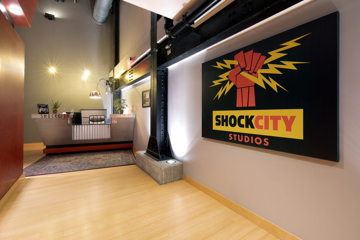
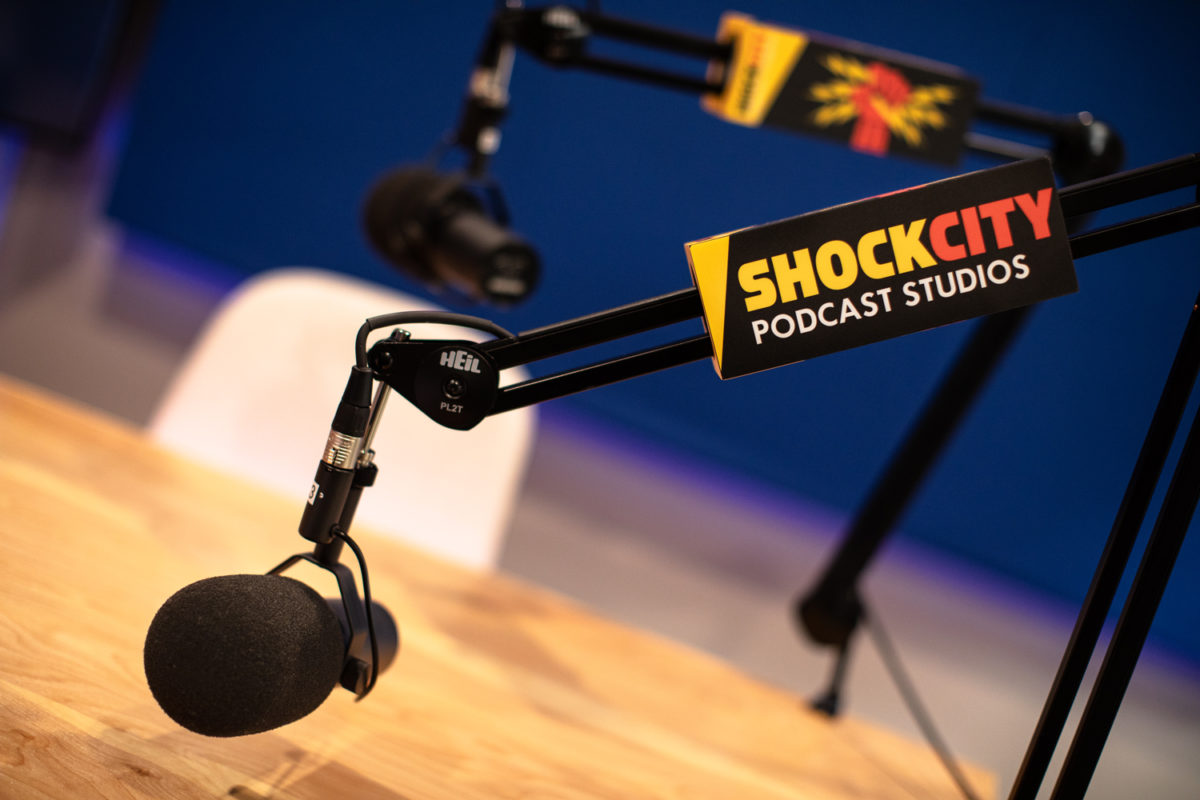
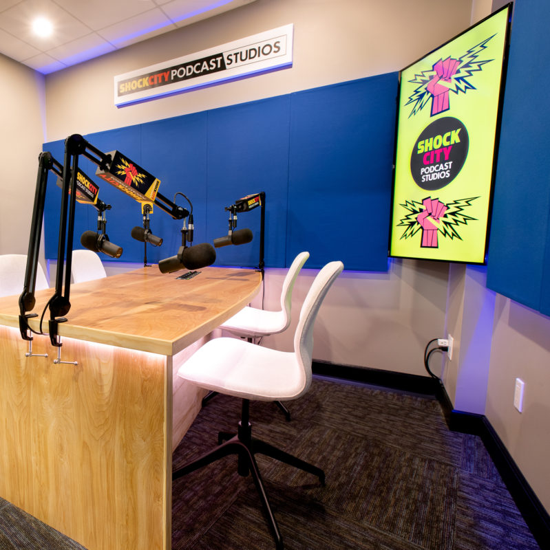
Shock City Studios, the Midwest’s largest recording studio, has always been passionate about creating top-tier music and working with incredible talent. They wanted to refresh their brand to provide a bold, consistent, and confident presentation across all platforms that accurately reflected the dynamic and professional energy of their St. Louis studio.
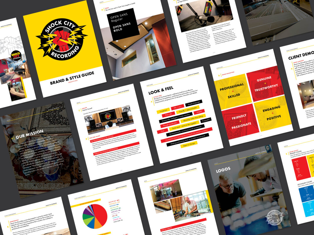
Shock City came with mockups of their original logo concepts from over a decade ago. We injected new life into them and curated a branding system that has that bold, edgy, cool, yet professional vibe.
We worked closely with the team to design a cohesive branding system that would stand strong across every media outlet and customer touchpoint. This new look wasn’t just about aesthetics—it was about creating a bold visual identity that resonated with their target audience.
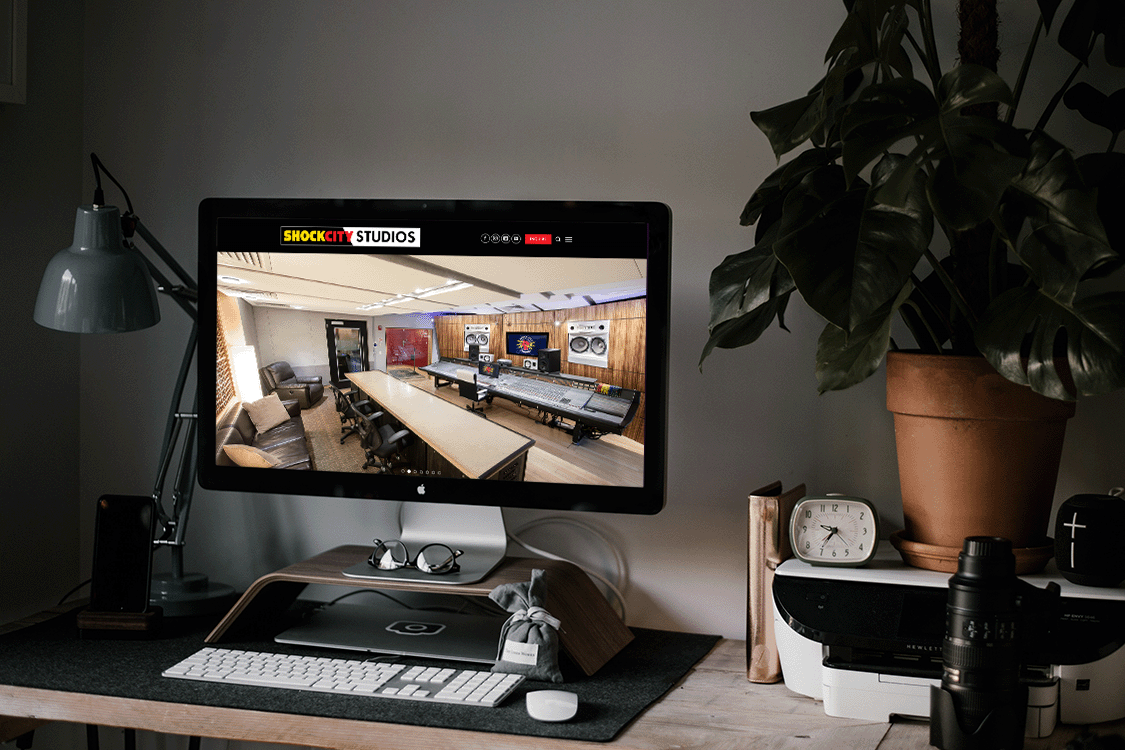
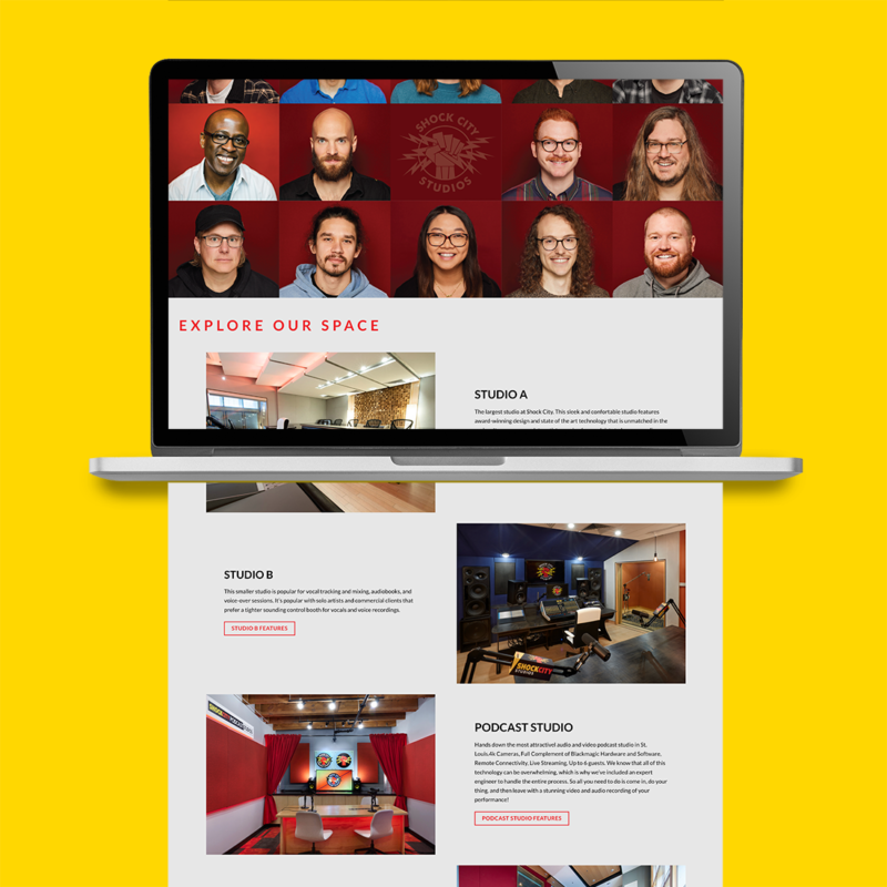
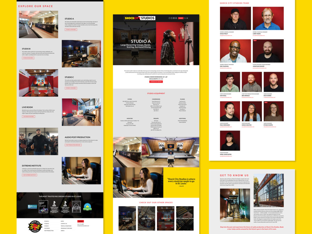
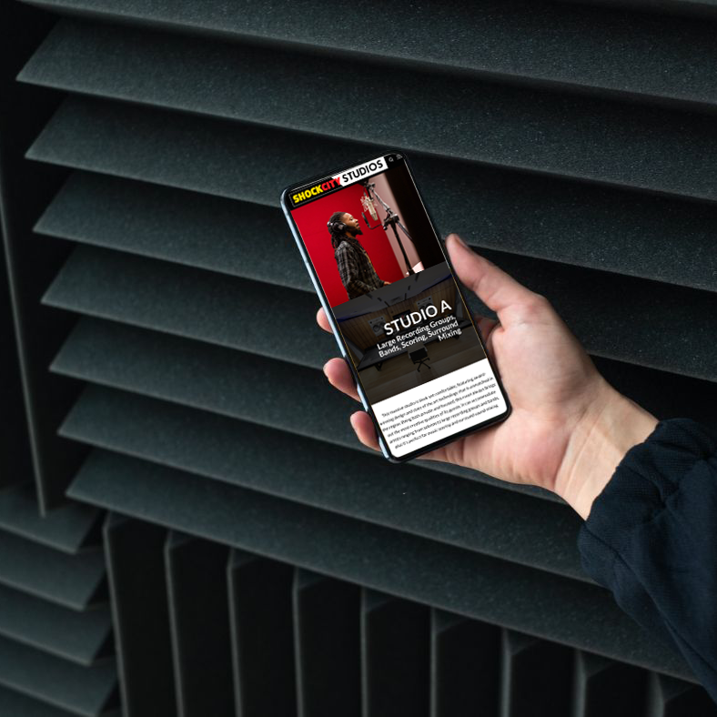
The branding transformation extended to their website as well. We designed and developed a new WordPress site that showcases their state-of-the-art recording rooms and expert technicians, putting their space and services front and center. From their new logo to marketing collateral, every piece now reflects the energy and professionalism that Shock City Studios brings to the music world.
Check out the new look at shockcitystudios.com.
DELIVERABLES
Brand Identity
WordPress Website
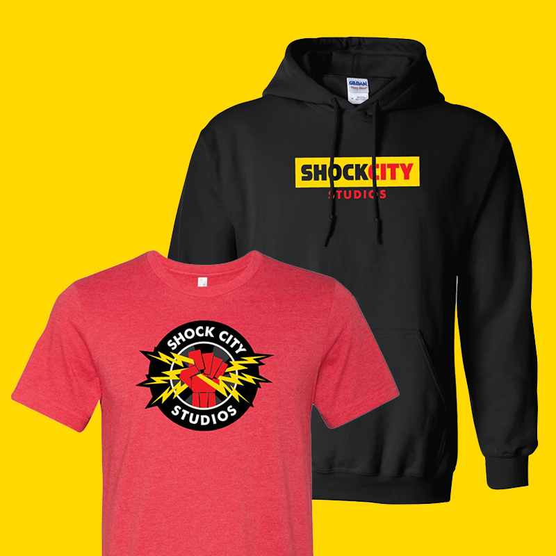
Marketing Collateral
Photos by Jeannie Liautaud Photography