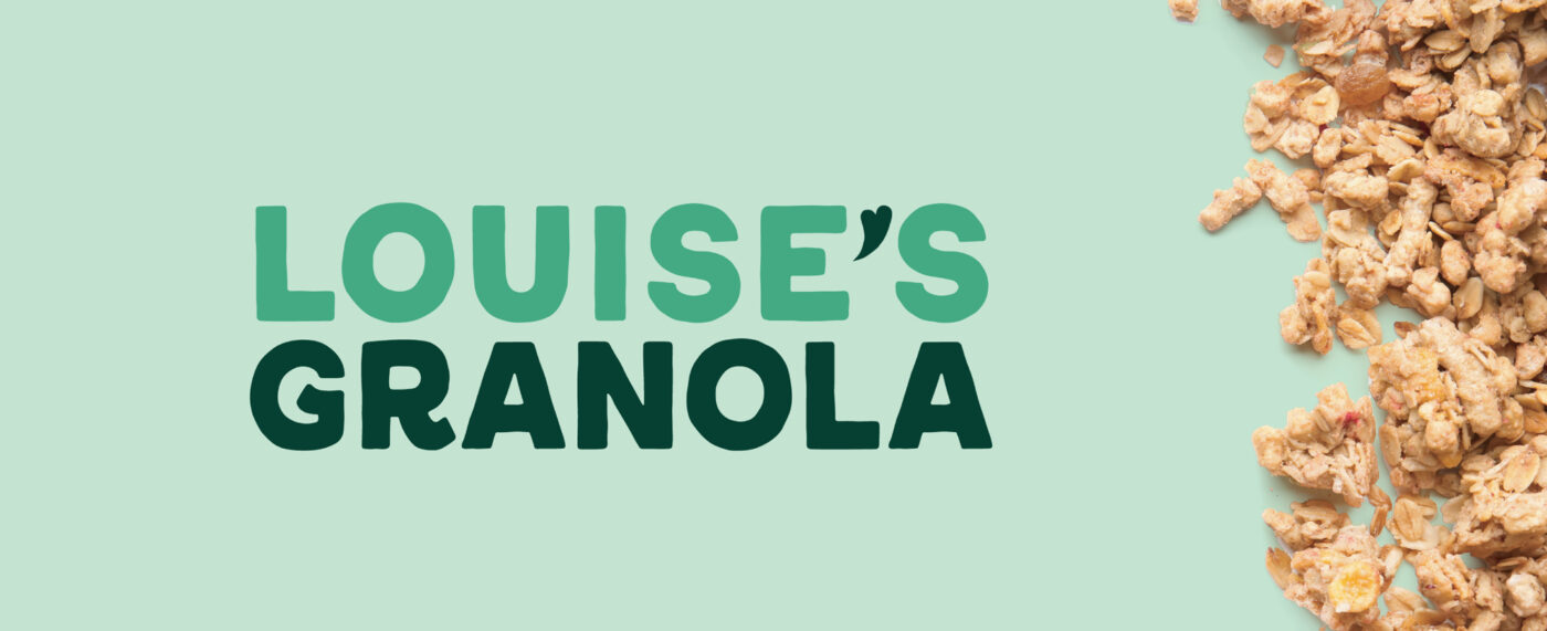
Louise’s Granola
Louise’s Granola is a local, family-run business dedicated to crafting the tastiest granola you can feel good about eating. Having successfully expanded into retail shops, grocers, pop-up markets, and even supplying local businesses with their granola, they were ready for the next phase: a refreshed brand and updated packaging.
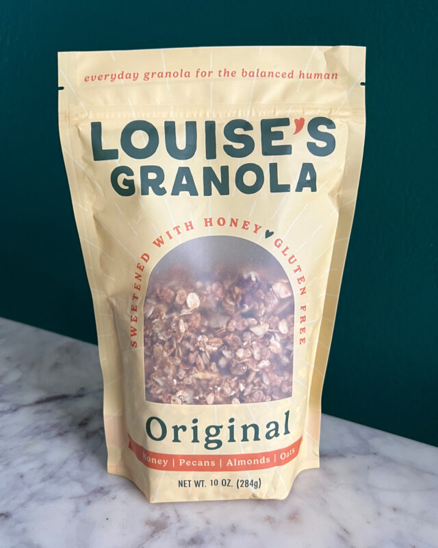
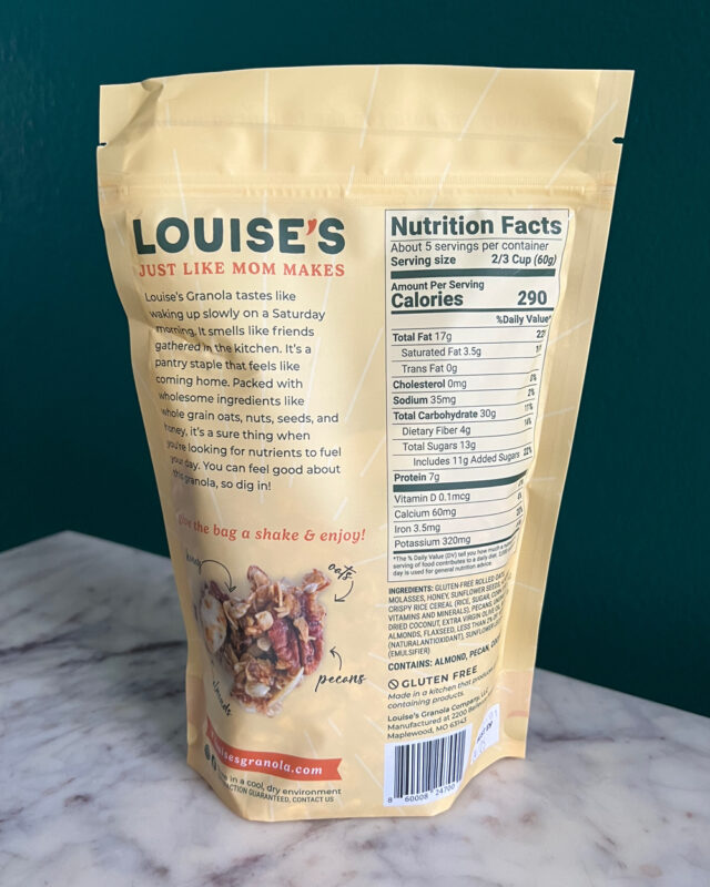
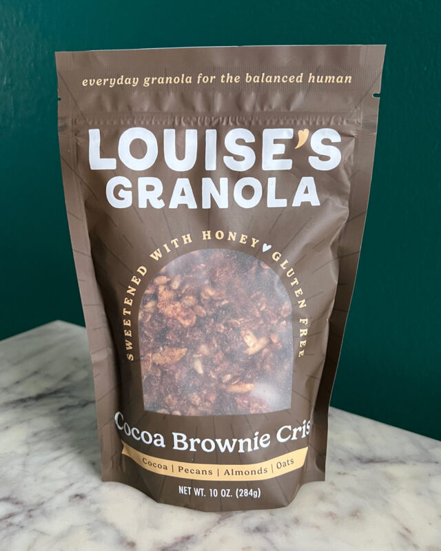
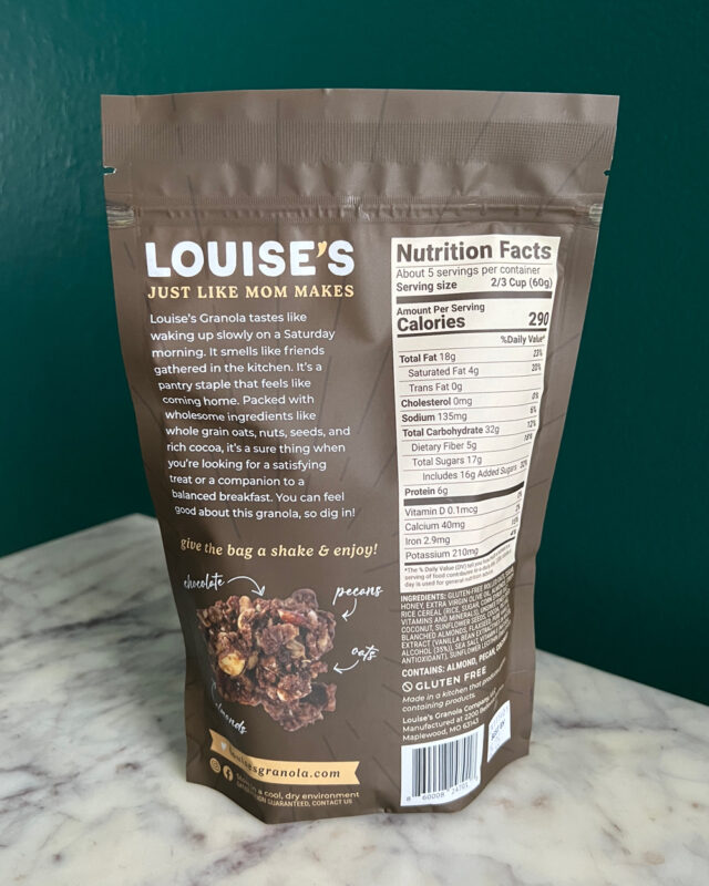
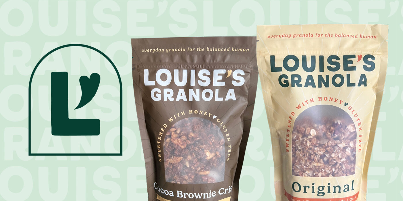
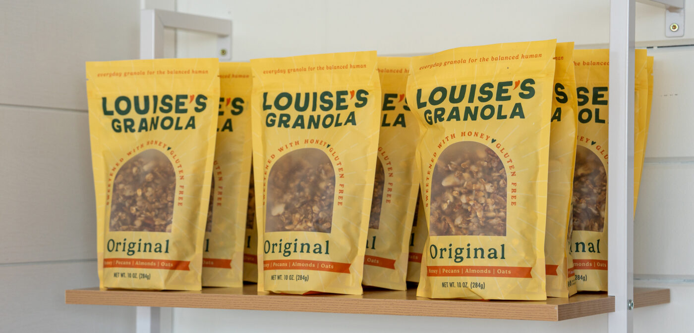
With production scaling up, hand-applied labels were no longer practical. We designed sleek, custom pouches for each flavor, featuring a minimal color scheme and an arched product window that subtly echoes the cozy, home-like feel of their logo mark. The result? A fresh, cohesive brand and packaging system that elevates Louise’s Granola while staying true to its roots.
DELIVERABLES
Brand Identity
Packaging Design
A HOMEMADE BRAND
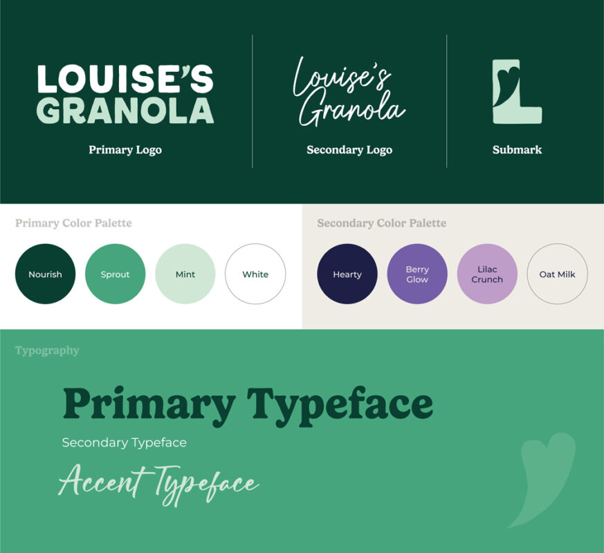
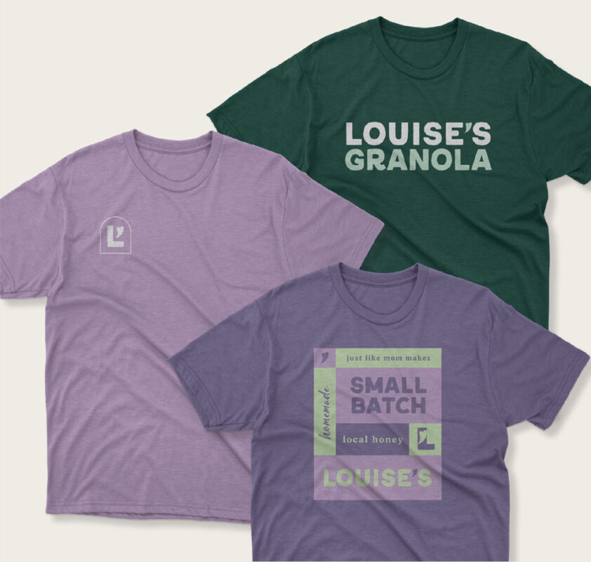
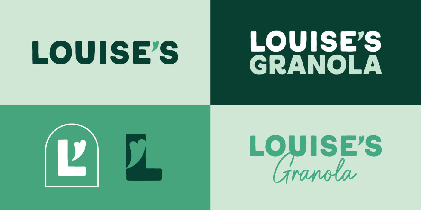
We began with a thoughtful brand update, ensuring the new identity felt as warm and inviting as home. The logo features soft, uneven-edged lettering—wholesome yet clean and bold—complemented by a refined color palette inspired by their original branding.